|
|
 |
|
nof-digitise Technical Advisory Service |
Ā
- Developing On line Learning Material
- Introduction
- Defining the learners and the outcomes
- Alternative applications of on line learning
- Development and usage issues
- Conclusion
- Planning On line Learning Material
- The Development Stages of a Project
- Learning design
- Developing a functional specification for learning materials
- Style
- Content
- Structure
- Target learners
- Purpose of a storyboard
- What is a storyboard?
- Guidelines for producing a storyboard
- Storyboards and user testing
- Designing On Line Learning Materials
- Trialling On Line Learning Materials
Developing On line Learning MaterialKeith Shaw The use of information technology to deliver learning resources has a 30 year old history. There have been examples of outstanding success in this time as well as initiatives that have failed to engage the interest or motivation of the intended learners. Success is associated with material that presents information in an active and engaging manner with much to commend it over more traditional learning methods. Interaction is more than simply presenting a limited range of objective style questions (predominantly poorly constructed multiple choice) or presenting material in a book-like manner. Best practice examples identify the circumstances in which the medium can make a unique and valuable contribution to the experience of learners. It is important at the start of the development process to examine the questions 'for whom?', 'why?' and 'how?' which hold the keys to acceptability and success. Whilst the following is considered to be 'best practice' It is recognised that many projects in the NOF programme do not have direct access to their prospective audience (as a college would have) so that addressing the following considerations will present a more difficult challenge. Defining the learners and the outcomes 'For whom?' is sometimes addressed rather superficially. The target population needs to be defined carefully and the desired learning outcomes specified appropriately for the audience. Analysis of what the learners currently know or can do, and what they need to know or be able to do, will identify the performance, knowledge or skills gaps (although in some cases this can be readily identified). A description of the desired learning outcomes, and how these will be recognised and assessed, should then follow. Defining a target population includes describing their known or predictable characteristics, where the material is likely to be used and anticipated access environment. Characteristics include likely prior knowledge or experience, educational attainment, and anticipated familiarity with the media to be used for delivery. In some cases it may be desirable to state that prior knowledge is important and to provide references or links to other sources of information that will help to prepare the learner. Alternative applications of on line learning Defining the learners and the outcomes Developing a justification in response to the question 'What added benefits do online materials bring?' demands a rational analysis of the contribution the medium can make in the envisaged circumstances of application and identifying the features of the medium that create an advantage over alternative means of presentation? One of the most powerful justifications is that the technology allows approaches which might not otherwise be possible, for example the simulation of events which are inherently dangerous, difficult or time consuming. Alternatively it can facilitate investigations which require accessing information from a variety of sources, analysis and application of this information, and solving problems or undertaking other challenges which actively engage the learner in making decisions and drawing conclusions. Transforming otherwise bland qualitative exercises into ones where quantitative exploration can be carried out through the rapid replication of otherwise tedious calculations and exploring 'what happens if …' is another valuable application. In all these cases there is the opportunity to create circumstances which lead to the establishment of understanding as well as acquisition of knowledge, and to create mechanisms whereby this understanding can be demonstrated and confirmed. Other well rehearsed justifications are those applying to any open and flexible learning approach such as the ability to study at one's own pace, in a variety of environments and at a time of choosing. The starting point is often a desire to teach a larger body of knowledge or even a whole topic, even though it might be broken down into small, digestible, elements or 'learning objects'. The challenge here is to avoid unnecessarily didactic approaches or the creation of electronic books. The outcome should warrant the justification that it gives rise to more effective learning. This leads on to the next question: 'how?' (ie. the design of the learning experience and the construction of the material). A crucial task is the establishment of an appropriate development team with adequate resources. Successful teams require a variety of skills and expertise. People with an understanding of how technology can be applied to good educational effect, and experience of designing effective interactive learning materials (sometimes called instructional design), is very important. Equally fundamental is subject matter expertise, experience of mediation in the subject and graphic design. Other essential skills are a thorough knowledge of the capabilities and limitations of the technology and the ability to construct, implement and support the technical aspects of the project. There are features of on line learning which make it unique in the spectrum of open and flexible learning technologies, such as the ability to communicate remotely with experts and other learners, and accessing other resources. These features can help learners manage and structure their approach to learning, and ensure that learning outcomes can be consolidated. Designing these types of experience presents new and complex challenges to the creators. They are deciding about more than content; they are designing a complete and integrated experience utilising a variety of resources and activities. They have to determine which features of on line learning to incorporate, such as communications with subject experts, communications with other learners, sharing applications and access to other Internet sites. They have to devise the activities, research and review resources, determine appropriate strategies for the use of these resources, anticipate how learners might approach a discovery learning exercise, and ensure the structure is sufficiently flexible to accommodate the alternatives yet capable of delivering a coherent learning experience. They also have to decide how the learner will be directed and supported. Too much freedom can create insecurity in the learner and inhibit learning, too little may frustrate the learner. These heuristic approaches are lengthier and more costly to develop and implement than their more didactic counterparts. They also generate a number of interesting questions such as:
The advent of on line learning has raised a number of significant questions as well as creating a wealth of opportunities. These opportunities need to be exploited wisely and the mistake of assuming on line equates to intrinsically motivating must be avoided. Materials must be engaging and require active participation by the user; they should generate a desire in the user to learn and to develop. They should be sufficiently flexible to allow different modes of use and they should appeal to a wide variety of users at very different life-stages. Planning On Line Learning MaterialsThe Development Stages of a Project The diagram below illustrates the different stages that you will need to consider when planning your project. 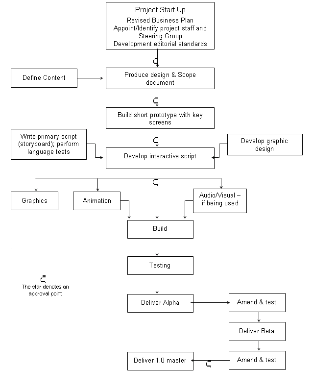
Standards should be established for spellings (eg -ise or -ize), abbreviations, punctuation, use of italics, emphasis, gender, style for lists, rules for numbers (in figures and words), spacing after full-stops and line spacing. Frequently used terminology should also be standardised at the beginning of the project - so that every team member uses the same terms. The interaction of the learner with the materials is one of the most significant factors affecting how the learner progresses and should be considered central to the design of your materials. It is important that a clear approach to learning is demonstrated in the design. For instance, the materials might enable differentiation in subject, level, learning styles, learning rates and access to learning. They should also support learners with special needs, as far as possible. You should consider the following within the design of your materials:
Developing a functional specification for learning materials Thought should be given to the functionality of the materials and any interactions to be used should be fully defined in your documentation. The following items should be planned and described:
The style of the materials will need planning and consideration given to the branding and overall graphical treatment. Careful consideration needs to be given to the content and subject experts should be used to make decision about:
The structure of the material needs defining in terms of:
The number, the location and the characteristics of the learners should be documented. Characteristics may include familiarity with computers. A storyboard sets out the content of the materials to be developed and describes the format in which it will appear in the finished product. It should be checked by the subject expert before it is committed to screen. The storyboard is the presentation of the material to be delivered in the package in a narrative format, including screen content, audio script and a description of any interactions and graphics specified for each screen. Guidelines for producing a storyboard The storyboard should detail:
A storyboard can be used as a basis for testing ideas with potential users of the site, to help generate ideas and test your assumptions. Designing On Line Learning MaterialsCreating the look and feel of your learning materials will probably be thought to be the 'fun' part of the project but if they are to be accessible to all groups of learners the design will need serious care. You must comply with the NOF-digitise Technical Standards in your project. These standards are designed to enable optimum accessibility and usability of the materials that you develop and to help preserve the materials for future re-use. Remember that users will include those with physical, language or cognitive disabilities, and those who are visually impaired and people who are hard of hearing or deaf. Some learners may have multiple disabilities. Other users will be using slow internet connections, or will be using a wide range of devices which will not support the use of plug-ins. You should consider testing your site with a text-to-speech browser at an early stage in the design process. Some projects may additionally wish to consider recognising IMS Guidelines for Developing Accessible Learning Applications ( http://www.imsglobal.org/accessibility/accwpv0p6/i msacc_wpv0p6.html - note this is a White Paper due for release early in 2002 ). The following notes provide important basic guidelines for screen design, use of text and graphics, navigation, multi-media, assessments and activities. Screens should be uncluttered, and data and information should be ordered consistently, so as not to confuse learners with learning difficulties. Try to ensure that screen elements share similar appearance, location, and behaviour. The learner interface should be consistent throughout. Try to use appropriate colours that all individuals can recognise, taking into account colour blindness. Use high contrast colours such as white on a black background, so that the text is clear to the learner. The use of more than five colours (including black and white) may be confusing. Where possible, use strong shapes as well as colour, to help learners discriminate between objects/images. Present the key information at the top of each page. Ensure all links are identified/named logically and clearly - a blind person may navigate using these. For example, "Click here" is not informative to the user. Links to other pages or related resources need to be easy to find. Try to ensure that there are no more than three levels of menu before reaching the content. If links or resources are difficult to find then this will discourage learners, de-motivate them and they may lose their way. Ensure that the most used links come first so that if learners are using the tab key they will meet these first. Limit the number of links per page to about 20. Make sure there is space between the links. Try to minimise the number of hypertext links that appear in a single line of text. In preference to this use vertical lists of links. Menu options should be self-explanatory and limited in number. Layout of Text - the material should be broken down so that between five and nine points are made at a time. This will avoid information overload and ensure that the learner can access the materials in bitesize chunks. Lengthy sections should be broken down into chunks and paragraphs should be kept short. Bulleted and numbered lists should be used rather than lists in prose. Label graphical images with text (see below for use of Alt Text and Longdesc). Icons should be clearly visible, customisable in size and named logically and clearly. Try to avoid using images made up of bitmapped text. Screen readers cannot read the text contained in images. Any interactive content that requires the learner to press a key should not be time-limited. Animations that use text should show the text long enough for a slow reader to read it. Essentially, this should be under learner control. Learner control should also be available for selection of sound and its alternative representation. Document metatags should be used to improve searching. Ensure the search facility is forgiving in terms of spelling. Consider a system for version control which will display the date, version number and the date it was created. This will assist in user-testing and piloting of your site. Text should be a mixture of upper and lower case letters and should be left justified with a ragged right edge. The length of a line of text should ideally be between eight and twelve words for some user groups. The clarity and legibility of information depends upon the visual contrast between fonts, text blocks, headlines and surrounding white space. Do not specify the text in pixels as it is difficult to magnify. For more background information see - http://www.lighthouse.org/bigtype/universal_graphic_des ign.htm Potential problems include: Italic text - some learners may find this difficult to read. Underlining text- this is also difficult to read and some users may think the text is a hyperlink. Tables for formatting, because the cell contents may be presented in a wrong or misleading order. Tables to control text width may not work if larger (or smaller) font is selected; it is generally better to let users control the window size. Flashing text - many users find this difficult to read - especially those with dyslexia or epilepsy. Upper case text should be avoided, even in headings because it is not accessible to all groups of learners. Unnecessary capitalisation should be avoided. Too many Acronyms and Abbreviations should be avoided as screen reading software may read them as a word. Other considerations include: It is recommended that animated or moving graphics are not used, unless the animation is necessary to illustrate important information, such as animation demonstrating how a machine works. It is best to place the animation on a different page, or to set it up to start only when activated by a mouse click or keystroke. The size of text and graphics affects usability as well as accessibility. For those with visual impairments, magnification can make the difference between being able or unable to use the application. Where multimedia is used, displaying more than three rows of text at once may prove impractical, as the viewer may have difficulty reading the captions and keeping up with the video. There needs to be an easy-to-use facility to print, copy and save the desired portion of text (as a text file - not html) or a picture. Provide information for learners to change their default settings. For more background information see http://www.lighthouse.org/text_only/t_about_browser.htm There must be keyboard access for all menus, controls and buttons, in the form of single key. Note that these may already exist in an application and any additional keystrokes should be consistent and compatible. Some learners using a screen reader will navigate via links - make sure links are labelled logically and meaningfully. Pages should be broken down into meaningful self-contained chunks, which do not overflow onto the next page; this will enable the learner to absorb the information contained in the chunk of learning, before progressing. Units should be structured into sufficiently small elements so that learners can easily leave and return to the current point, using a bookmarking facility or a system of menus. Buttons or keystrokes should be provided for ease of navigation to allow the learner to exit the current section, move upward within a hierarchy of menus and, from the top level, to exit the material. It should be difficult for the learner to close the application down accidentally (by exiting a current section) - there should be a logging off procedure. The learner should have access via buttons or keystrokes to help and/or hints on the materials and technical issues. The learner should be provided with the facility to play, pause, stop and restart any audio or video associated with the current screen, to ensure that they can control their own speed of progress through the material. Progress indicators (breadcrumbs) should be located at the top of the screen. A progress bar shows the learner how far through the material he or she is. Learners should know where they are within the package at all times. All buttons should be located in the same position on all screens for ease of navigation. The Back button allows learners to review screens that have already been viewed by moving backwards through the material, screen by screen. It is also used to enable learners to have another attempt at questions or activities. The Menu will take the learner directly from any tutorial screen to the menu screen. Where the material has more than one menu, this button will take the learner back to the previous menu in the hierarchy. Avoid rollovers for navigation - this may be impossible for those with motor difficulties or those using keystrokes. Avoid colour-dependent navigation, with instructions such as 'Click on the Green button' Where larger buttons are used, the amount of screen space available for the learning material is reduced. It is often a good idea to use different versions of buttons: 'available' (out), 'selected' (in), and 'unavailable' (greyed out). Titles or headings ensure that learners always know where they are within the package. Choose a suitable point size for headings - so as they are clear but not too imposing. Do not crowd the screen with too many headings. The learner should also be provided with an introduction to the learning material - possibly through the use of an introduction screen, to include at least the following:-
It is important to remember that graphical images should be used for instructional, motivational, or attention-focusing effects, and not simply for the sake of including them on the screen. Every item on the screen should earn its place. Graphics should be crisp and clear. When graphics are used there should be a text alternative to the image. Sound and video should be used with caution and only when they aid understanding. Video and audio tracks can be used, and multiple text tracks may be included within the clip. Multimedia materials can also be used to overcome problems of accessibility, particularly for use by learners with special educational needs. Users without the capability of playing sound, as well as the deaf and hard of hearing can benefit from the use of captioned movie clips in learning materials. Users can view captioned clips and follow the soundtrack visually rather than aurally. For maximum accessibility transcripts should always be used in conjunction with audio-only clips. People who have special needs, whose first language is not English or who have low literacy skills may have problems downloading, using or accessing plug-ins easily. Where an applet is used to play a video clip, a text description should be provided. Try to ensure that at the specified minimum bandwidth there is a delay of no more than ten seconds in the loading of an image or animation. Audio effects should be free from extraneous noise, such as unnecessary hiss and page turns etc. which can be distracting to some groups of learners. Examples of accessible media rich materials can be found at - http://ncam.wgbh.org/richmedia/showcase.html This is an area where many learners are often excluded due to inappropriate design. Drag and drop should be usable by mouse or keyboard. Multiple-choice questions can be difficult for learners to engage with. Avoid too much scrolling and it may be appropriate to open a new Window for each question. Ensure different sources of information are available separately. Avoid information that is available only in graphic format eg. a pie chart Provide alternative activities, for example it would be inappropriate to ask a visually impaired person or someone with a motor disability to draw a diagram. However, remember that equivalent access (providing your resources in a range of formats) is preferable to alternative access. Remember that the above are only a guide. Please refer to the nof-digitise programme technical standards and guidelines and test your learning materials with all groups of learners. Revised by Shirley Evans, Royal National College for the Blind, Hereford. Trialling On Line Learning MaterialsIdeally, a pilot or prototype should be produced - even in small projects. The prototype should be run on hardware with the exact target specification and should be produced early in the project. This will reveal any potential technical problems and 'look and feel' conflicts before they become serious, preventing costly changes later on. The purpose of the functional prototype is to demonstrate how each element will function and test how users interact with the material. The prototype should also demonstrate the proposed interface, functionality and screen layout. The prototype should be tested with as many end-users as possible, and if appropriate, use their feedback to develop a further prototype. What should be included in a functional prototype The functional prototype is a fully working sample, and as such should contain an example of every element of functionality to be used in the material. A functional prototype typically comprises the following:
The functional prototype should be submitted to your 'client' who must check:
At the start of the project you should identify the quality expectations for the learning materials and at an early stage in the development the proposed design, in the form of the functional prototype, should be tested on a sample of users. The purpose of the trial, is to ensure that the material will function correctly and is effective for the target users before the majority of the content has been incorporated. Users, or, where applicable, subject specialists should be used for content testing. In the case of a consortia those involved in the trialling should be drawn from more than one group to avoid bias. This trialling team should be responsible for approving the content of the learning materials, beta testing and providing user evaluation of the materials. A checklist-based approach should be used to assess the learning materials against quality criteria. End user testing must be conducted at each stage.
You should record your observations on a Usability Trial checklist. Remember to attribute problems to the product rather than to the user. Record your observations and use prepared prompts on areas of particular interest, such as new types of functionality, or for example ask - 'Do you find the Help facility useful?' 'Are the question feedbacks helpful? etc. Assess the experience of users Log the following information about users, eg:
Assess the motivation of users Establish and record the motivation of users towards the product, and towards the use of a computer as the means of delivery. To assess how easy the prototype is to use you will need to record the actions of users, noting:
To assess how easy the prototype is to understand record the actions of users, noting:
Appropriateness of delivery style To assess the effectiveness of the delivery style record the actions of users, noting:
Assess the environment in which the usability trial takes place To assess how the delivery environment will affect the use of the materials you will need to record the actions of users, noting:
You will also need to compare and record any differences between the trial environment and the intended delivery environment |
Ā